
Interior Design
The Psychology of Colour in Interior Design
RitZi Stagings · 8 September 2026
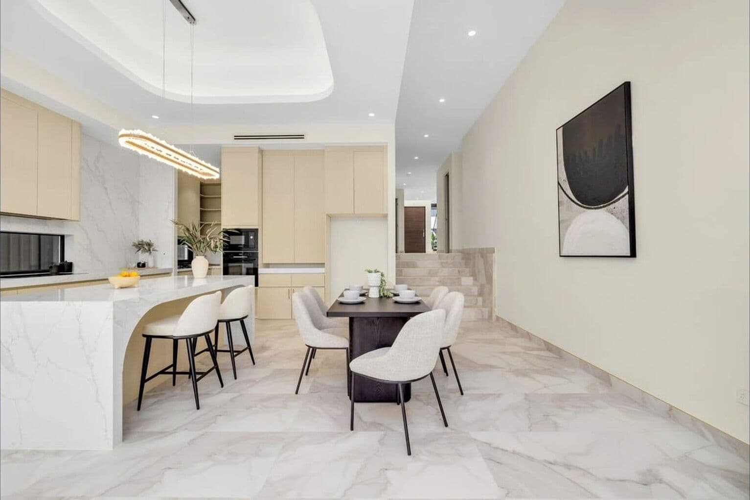
Colour is one of the first things a buyer registers when they walk into a room, often before they've consciously noticed the furniture, the layout, or the light. It sets an emotional tone in seconds, and that tone shapes how generously a buyer reads everything else in the space. Understanding a little of the psychology behind it makes it much easier to choose a palette that actually works for a listing, rather than just defaulting to "neutral and safe."
Why Neutral Isn't the Same as Colourless
"Go neutral" is common staging advice, and for good reason, a neutral base lets buyers project their own taste onto a space rather than fighting against someone else's. But neutral doesn't mean beige-on-beige with nothing else going on. True neutral palettes still have warmth and depth, layered off-whites, soft greiges, warm timber tones, that read as considered rather than stripped back. A flat, cold neutral can feel just as uninviting as a colour that's too bold, it just fails quietly instead of obviously.
The goal isn't the absence of colour, it's colour that recedes enough to let the room's proportions and light do the talking, while still feeling warm enough that buyers want to linger.
Warm Tones Build Comfort, Cool Tones Build Calm
At a broad level, warmer tones, soft terracottas, warm timbers, dusty pinks and rusts, tend to make a space feel welcoming and lived-in. They work well in living rooms and entries, where the goal is an immediate sense of comfort. Cooler tones, soft sages, muted blues, warm greys, tend to read as calm and restful, which is often exactly right for a main bedroom or a bathroom.
This isn't a rule to follow rigidly, plenty of beautifully staged living rooms lean cooler, and plenty of bedrooms work with warmth. But it's a useful starting point when a room feels a little flat: if a living space isn't reading as inviting, warming up the palette slightly, through cushions, a throw, or artwork, often does more than any single piece of furniture.
The Accent Colour Rule of Thumb
One of the more reliable structures in colour styling is roughly 60% dominant neutral, 30% secondary tone, and 10% accent. The base walls and large furniture carry the neutral, a secondary tone (often through a rug or an upholstered piece) adds depth, and the accent colour, usually the boldest choice in the room, shows up in small doses: a cushion, a vase, a piece of art.
This is why a single terracotta cushion or a deep green vase can transform a room that would otherwise feel one-note, without ever risking the "too bold for buyers" problem. The bold colour is doing real work, it's just doing it in a small enough dose that it reads as intentional styling rather than a personal colour preference imposed on the space.
Matching Colour to the Light a Room Actually Gets
Colour doesn't exist in isolation from light, the same paint colour can look completely different in a north-facing room flooded with afternoon sun versus a south-facing room that only gets soft, indirect light. Warmer, richer tones tend to hold up well in rooms with less natural light, they keep the space feeling cosy rather than dim. Cooler, lighter tones make the most of a naturally bright room without competing with the light.
If a room has always felt a little "off" despite good furniture and layout, it's worth walking through it at the actual time of day inspections happen, and checking whether the existing palette is working with the room's natural light or against it.
A Few Reliable Combinations
- Warm neutral walls with terracotta and rust accents, and timber furniture, for living areas that want to feel grounded and inviting
- Soft sage or muted green with warm white and natural linen, for bedrooms and spaces meant to feel restful
- Warm greige with black or bronze metal accents, for a slightly more contemporary, elevated feel
- Dusty blue with warm timber and brass, for a calm but still characterful main bedroom
None of these need to be followed exactly, they're starting points rather than formulas. The right palette always depends on the specific light, layout, and existing finishes of the property.
Colour is a genuinely underrated part of styling a home to sell, it's easy to focus entirely on furniture and layout and treat the palette as an afterthought. But get the colour psychology right, and buyers walk into a space that already feels warm and considered before they've registered a single piece of furniture. If you're not sure whether a property's current palette is helping or working against it, we're always happy to take a look.
Ready to style your next listing?
Get a free, no-obligation quote from RitZi Stagings.
Get a Free Quote